Project Details
Autolayer Pixel Perfect Gsap Clone

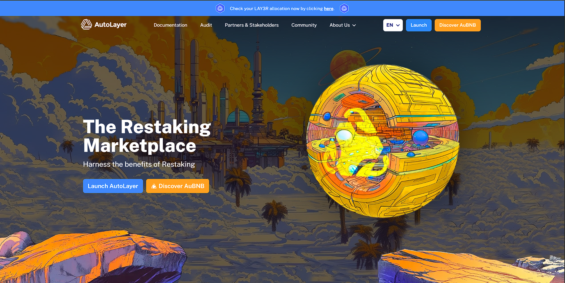
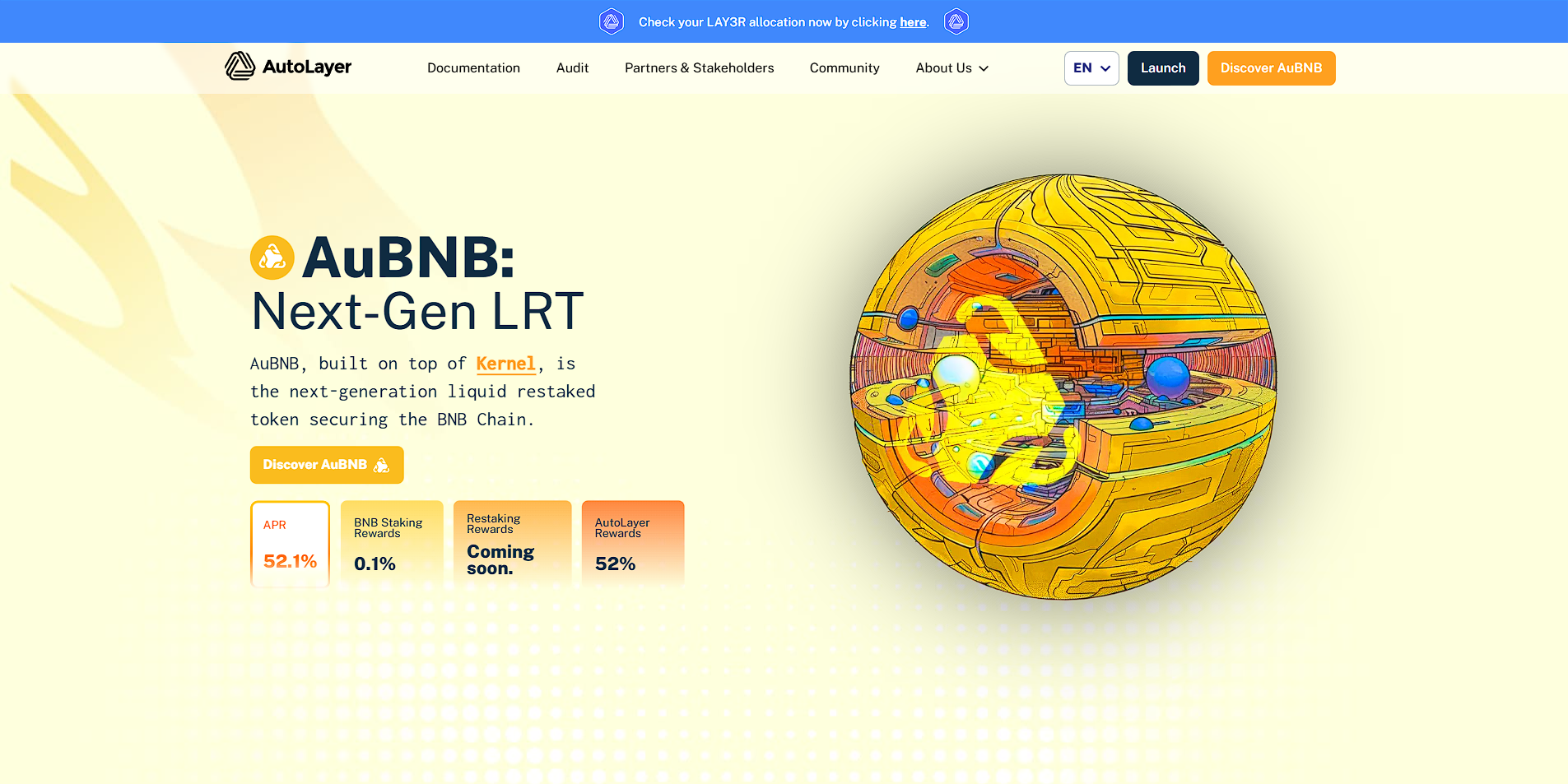
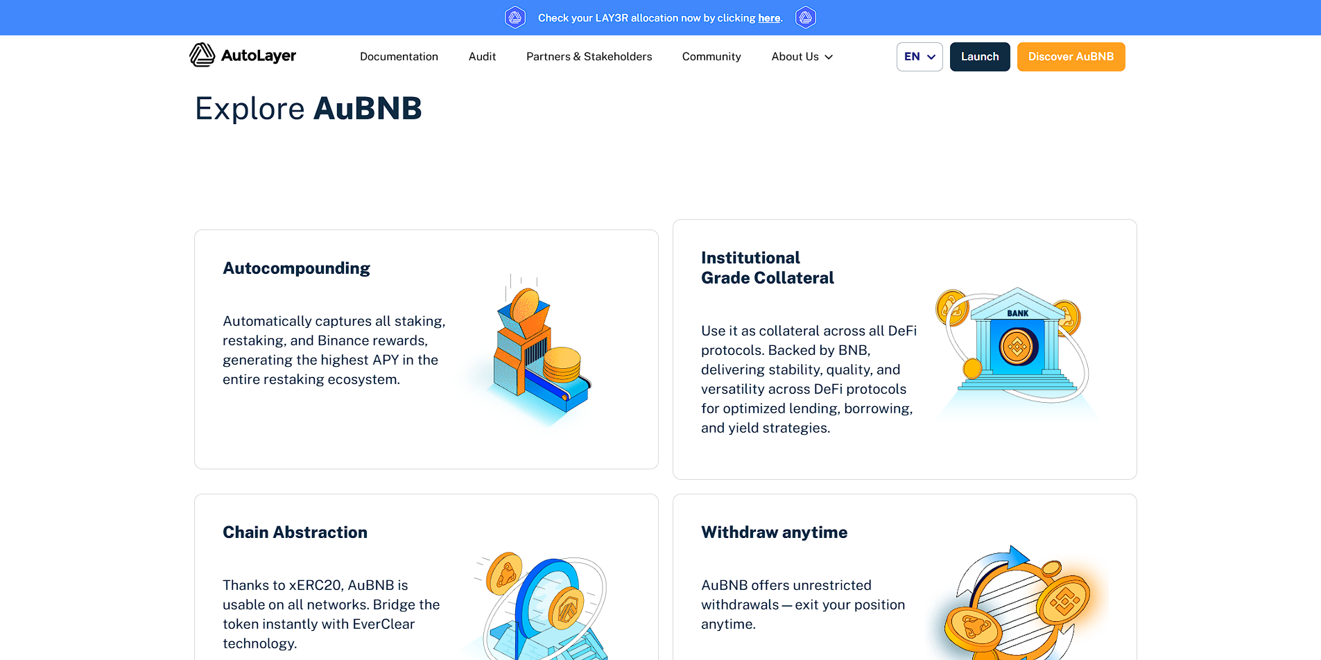
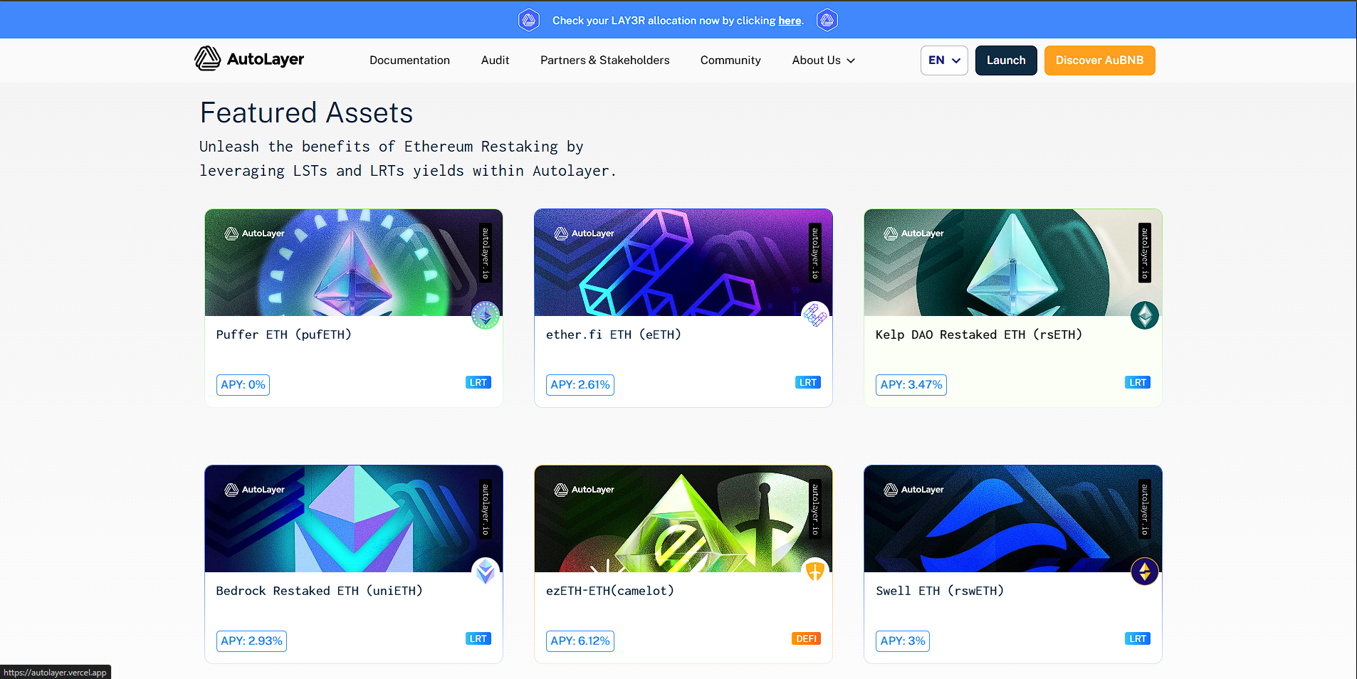
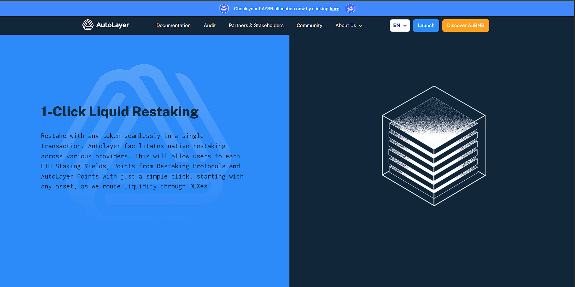
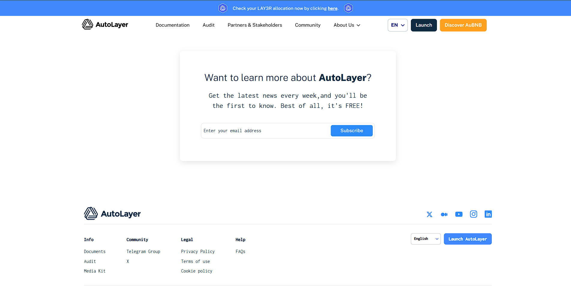
Autolayer – Pixel-Perfect Animated Website Clone with Enhanced Performance
Autolayer is a pixel-perfect frontend clone of an existing website, rebuilt from scratch using HTML, CSS, JavaScript, and GSAP to deliver superior performance, responsiveness, and visual appeal. This project replicates every design detail with high accuracy while introducing smoother animations and transitions to elevate the user experience. By focusing on UI precision and animation fluidity, the site demonstrates deep expertise in frontend development and interaction design. Autolayer serves as a showcase of technical mastery in crafting high-performance, visually engaging web interfaces.
High-Fidelity Frontend Clone with Smooth GSAP Animations and Optimized UX
Category
website
Timeline
Feb 2025 - Feb 2025
Technologies
HTML, CSS, JavaScript, GSAP, Responsive Design, Cross-Browser Compatibility
Challenges
The main challenge in developing Autolayer was achieving a flawless visual match to the original site while improving the performance and fluidity of the user experience. Reproducing detailed animations and transitions required precision and an in-depth understanding of GSAP. Ensuring that the clone was responsive across devices and browsers while maintaining pixel accuracy demanded meticulous layout planning and styling. Performance optimization was also key, as the goal was to reduce load times and eliminate jank during animations, even on lower-powered devices.
Solutions
To overcome these challenges, the frontend was carefully hand-coded with semantic HTML and modular CSS to ensure maintainability and scalability. GSAP was employed to recreate and improve upon original animations, enabling smooth, hardware-accelerated transitions. Responsive design techniques were implemented to ensure the layout adapted seamlessly to all screen sizes, while media queries and flexible units preserved design integrity. Performance was fine-tuned by optimizing image assets, minimizing reflows, and using GSAP’s performance-friendly features, resulting in a fast, responsive, and visually rich experience.
ApexWebLab builds custom websites, CRMs, and mobile apps. Scalable, fast, and error-free digital solutions that grow your business.